
 So this week I take an in depth look at the latest crossover: “Trinity Wars” and tell you why you should be buying at least two copies of each issue, one to read and one for sealing in plastic to sell back later.
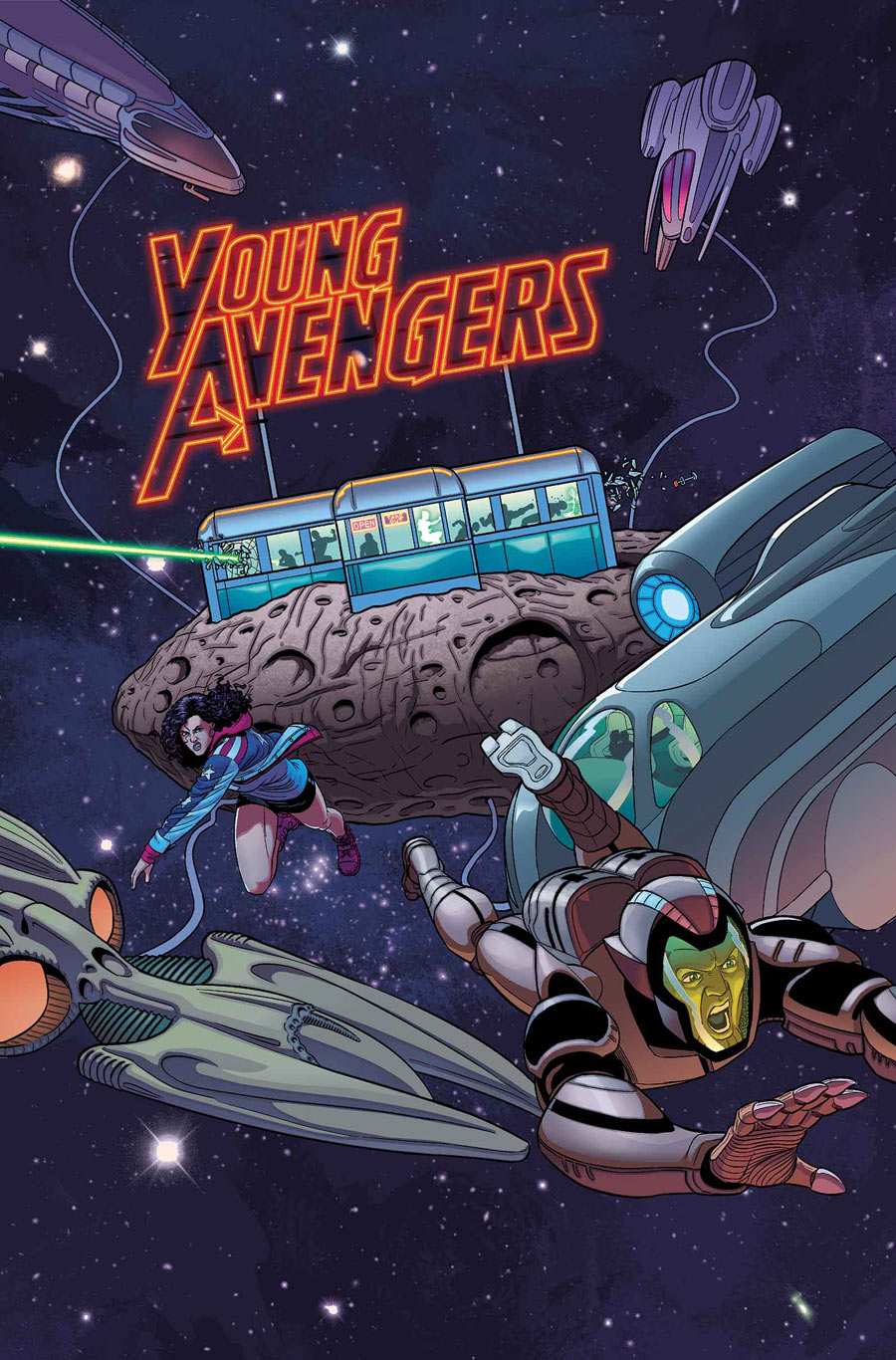
Nope, sorry. Couldn’t keep a straight face. What if I was really like that though? I know, weird. Anyways, I’m taking this chance to revisit a favorite of mine, “Young Avengers”. What could I possibly say that didn’t get you to buy the book the last time? Doesn’t matter because this time I’m going to focus on something that can go overlooked, page layout.
When I was in college working as a film major (gets you far kids, follow me and you can scrape through on random craigslist shoots) one of my teachers said that if you learn one thing about being creative it’s know your medium. So often student films devolve into two people sitting across from each other, talking. Why am I watching this if I could just as easily listen to it over the radio? In comics the same principles apply. There’s so much that the artist can do with the page that can’t be done anywhere else.
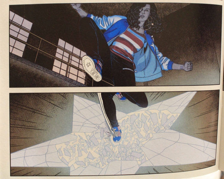
During this series Jamie McKelvie has done some amazing and visually unique things. In one issue he drew out the floor plan of a club on a double page spread that Noh-Varr assaulted. He tagged and footnoted every stop in the bar with what Noh-Varr did action wise and what he was thinking and it was so imaginative and different that I studied the page like a treasure map for at least ten minutes. In this issue, again he plays with page layout by employing Miss America’s power to traverse dimensions and literally break through the panel. Not only is it a fantastic way to convey an action but it was drawn so beautifully.
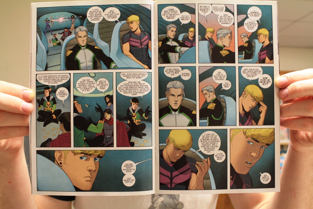
I always find it strange when other books don’t utilize the medium to its fullest potential. Every time I see panels full of exposition as a character stands statically in one spot I don’t get upset but I think, “Why didn’t you just skip the extra step and simply write prose?” The image doesn’t even have to be radical or something the reader has never seen before. Sometimes subtle use can just add so much more to the book. In this issue of “Young Avengers” McKelvie illustrates two conversations happening simultaneously with only an enlarged panel on the first page. Things like this make the book seem more organic instead of the pattern that some comics fall into: “Event, Talk, Talk, Punch, Event, Event, Kablam!” What I mean to say is that “Young Avengers” isn’t a series of events, one after the other. Things are happening all the time. Sometimes they are sequential and sometimes they are overlapping. But McKelvie doesn’t just stop at interesting panel work; he also loves collaborating with Gillen to make incredible “bonus” pages.
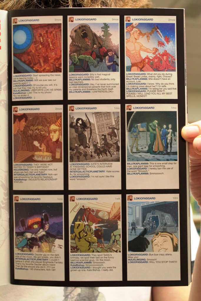
The bonus page for this issue was a smattering of posts to their fake equivalent to Instagram. The clever use of a series of still shots and comments from the characters help tell the reader what happened between issues. It’s very engaging and helps keep this book fresh and original. But how does this panel layout and intriguing bonus pages stack up to the impeccable aesthetics of “Invincible”?
I must make an admission. “Invincible” is not exceptional when it comes to panel layout. Ryan Ottley doesn’t experiment with anything that is out there or crazy. However, all of his layouts serve to reinforce the superhero feel of the book. It is unfortunate that he doesn’t get to do anything crazy but it wouldn’t really fit in the book. This isn’t me being defensive; this book is all about the superhero clichés being used to convey a better story. So the tights, the bad guys, the wonky science, even down to the dialogue and the panel layout all serve to further the feeling that it is an exceptional story cloaked in superhero conventions. It would be particularly out of place to see a crazy spiral of panels smeared across a double page spread. That being said, would I like to see some experimentation—yes, duh.
Still, comparing the two books, it becomes more and more difficult to stick with my bias. The only thing I can still attribute to “Invincible” that “Young Avengers” hasn’t achieved is longevity. So when “Young Avengers” hits issue 100 I will finally reverse my subjective favoritism towards “Invincible”.